Trykka design stuff, website, booklet
I recently redesigned TRyKKA’s website alongside their design on their newly released album. It was my first time to use grav and it was great fun.
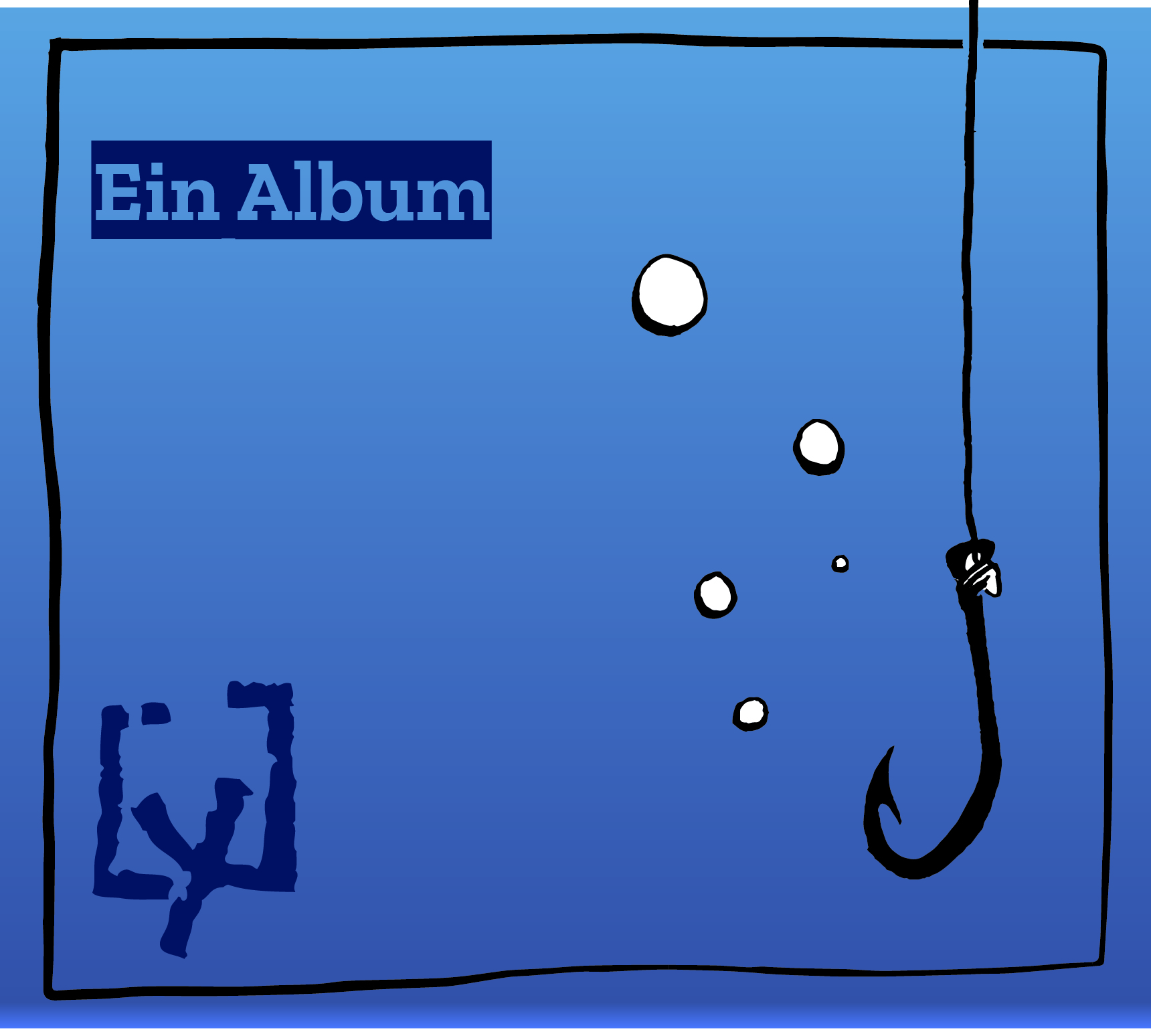
The album front-page looked like this and I tried to carry this design over to web.
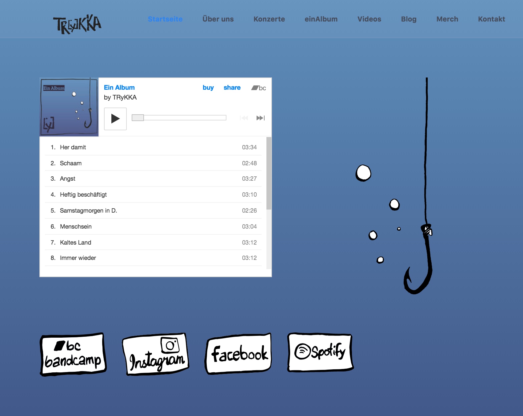
The resulting grav page now has this look and feel.
There had to be some serious adjustments to the Quark theme. Especially usefull was the bootstrapper plugin that enabeled me to use the awesome Bootstrap framework. I wanted a modern, responsive website. So Bootstrap is obviously the way to go. It especially makes possible that the anchor on the frontpage disappears on mobile making room for everything else and helps with large but responsive videos on the page’s videos section.

